
Exterior Paint Colour Trends and Seasonal House Colour Tips
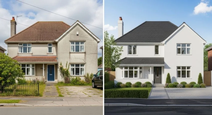
Your home's exterior is the first thing people see, and frankly, it's doing a lot of heavy lifting. It needs to look good in blazing summer sun, survive Canadian winters, and somehow still feel fresh when you pull into your driveway after a long day. That's a tall order for any paint job, which is why staying current with exterior paint colour trends isn't just about following fashion—it's about making smart choices that work.
Here's what most people get wrong about exterior paint: they think it's just about picking a pretty colour and slapping it on. But your house isn't a canvas—it's a structure that deals with weather, neighbours, resale value, and your own evolving taste. The right exterior colour needs to work with your home's architecture, complement the neighbourhood, and still feel like you.
The good news? The latest exterior paint colour trends are moving away from the stark whites and safe beiges that dominated the last decade. We're seeing richer, more complex colours that actually have personality. The challenge is figuring out which trends will look dated in five years and which ones have staying power.
We're going to walk through what's actually working in exterior paint right now, how to boost your curb appeal without going overboard, and why some colour combinations just make sense while others leave you wondering what you were thinking.
Ways To Increase Your Curb Appeal With Exterior Paint
Let's be honest: “ways to increase your curb appeal” sounds like real estate agent speak, but it's actually about making your home feel welcoming rather than just expensive-looking. The right exterior paint can make a small house feel substantial, an awkward house feel charming, and a boring house feel interesting.
Start with what you have
Before you start dreaming about dramatic colour changes, look at what's already working. Your roof colour, stone or brick accents, and landscaping aren't changing, so your paint needs to work with them. Fighting against your home's existing elements usually ends in disappointment.
If you have red brick, warm colours will feel harmonious while cool colours might clash. If your roof is dark grey, you have more flexibility with both warm and cool tones. Natural stone works with almost everything, which is why it's such a popular choice for accent walls.
The power of contrast
One of the easiest ways to add visual interest is through contrast, but it doesn't have to be dramatic. A slightly darker trim against a lighter body colour creates definition without being jarring. Dark shutters against light siding add character. Even something as simple as a bold front door colour can transform your home's personality.
The key is intentional contrast, not accidental contrast. If your trim is darker than your siding because that's what was cheapest, it might not look purposeful. But if you choose a deep charcoal trim to complement light grey siding, it feels sophisticated.
Don't forget the details
Curb appeal lives in the details. Your front door, garage door, window trim, and even your mailbox all contribute to the overall impression. These elements don't all need to match, but they should feel coordinated.
A fresh coat of paint on your front door is one of the highest-impact, lowest-cost improvements you can make. It's also a great place to experiment with colour if you're not ready to commit to painting your entire house.
Home Painting Trends To Look Out For
Home painting trends come and go, but the smart ones solve real problems. Right now, we're seeing a shift toward colours that feel more grounded and substantial—less Instagram-perfect, more liveable.
Warm neutrals are taking over
The stark white and cool grey trend is finally cooling off. Instead, we're seeing warm greys, soft taupes, and mushroom colours that feel more inviting. These colours work well with Canada's natural landscape and don't show dirt as easily as pure white.
Warm neutrals also photograph well, which matters more than it used to. Whether you're selling your house or just posting on social media, these colours look good in different lighting conditions.
Black and dark colours are having a moment
Black houses used to be rare, but they're becoming more common—and for good reason. Black is sophisticated, hides imperfections, and works with almost any accent colour. The key is using it thoughtfully, often with white or light-coloured trim to prevent the house from disappearing.
Dark colours work particularly well on modern or contemporary homes, but they can also make traditional homes feel more current. Just make sure you have enough contrast with your trim and accents.
Earth tones are back
After years of cool colours dominating, warm earth tones are making a comeback. Think sage green, warm terracotta, and deep blues that feel more natural than artificial. These colours work well with natural materials and feel timeless rather than trendy.
Earth tones also tend to age well. While bright colours might feel dated in a few years, colours inspired by nature have staying power.

Home Painting Ideas To Shake Things Up This Fall
Fall is actually a great time to think about exterior painting, even if you're not planning to start until spring. Home painting ideas to shake things up this fall centre around working with autumn's natural colour palette, which can inspire year-round choices that feel rich and welcoming.
Embrace deeper colours
Fall's natural palette—deep reds, golden yellows, rich oranges—can inspire exterior colour choices that feel warm and inviting. You don't need to paint your house orange, but a deep rust or warm terracotta can capture that autumn feeling year-round.
These deeper colours work particularly well as accent colours. A rust-coloured front door against a neutral house feels sophisticated. Deep green shutters add richness without being overwhelming.
Consider seasonal flexibility
Some colours work better with seasonal decorating than others. Neutral base colours give you flexibility to change your front door, planters, and seasonal decorations without clashing. If you love decorating for different seasons, choose exterior colours that won't fight with your holiday wreaths or summer flowers.
Think about winter
In Canada, your house needs to look good against snow for several months of the year. Colours that disappear against white snow can make your house feel invisible in winter. Darker colours or those with warm undertones tend to stand out better against snow.
This doesn't mean you need to avoid light colours, but consider how they'll look in different seasons. A warm white will feel more substantial against snow than a cool white.
Should the Exterior Colour Match the Interior?
This is one of those questions that doesn't have a simple answer, but here's the thing: should the exterior colour match the interior isn't really the right question. The better question is whether your exterior and interior colours should feel connected. Here’s what to consider:
Flow matters more than matching
Your exterior and interior don't need to match exactly, but they should feel like they belong to the same house. If your exterior is warm and earthy, a stark white interior might feel jarring. If your exterior is cool and modern, a traditional interior palette might not flow well.
The connection often happens through undertones rather than exact colours. If your exterior has warm undertones, your interior colours should probably lean warm too. This creates a sense of cohesion without being matchy-matchy.
Consider your entryway
The transition from exterior to interior happens in your entryway, so this space is crucial for creating flow. Your front door colour should work with both your exterior and your interior palette. Your entryway walls should feel connected to both spaces.
This is where you can create a bridge between exterior and interior colours. If your exterior is sage green and your interior is warm white, your entryway might work in a soft, warm grey that connects both palettes.
Practical considerations
Sometimes practical considerations trump design preferences. If you're planning to sell your house, neutral exteriors and interiors appeal to more buyers. If you love bold colours, you might choose to express that preference on your interior walls rather than your exterior.
Also consider maintenance. Exterior paint needs to be refreshed more often than interior paint, so you might not want to commit to the same colour palette for both.
Tips for Choosing Paint Colours
Choosing exterior paint colours feels overwhelming because the stakes feel high. You're not just picking a colour—you're making a statement about your home that everyone will see. Here are some tips for choosing paint colors that actually work.
Test in different lighting
Paint colours look completely different in morning light versus afternoon light versus artificial light. Test your colour choices on different sides of your house and at different times of day. What looks perfect in bright afternoon sun might look completely different on a cloudy day.
Most paint companies offer sample sizes, and it's worth buying several to test on your actual house. Paint large enough swatches that you can really see how the colour behaves.
Consider your neighbourhood
You don't need to match your neighbours exactly, but you should consider the overall character of your neighbourhood. A bright purple house might be perfect for an artistic neighbourhood but feel out of place in a traditional subdivision.
This doesn't mean you can't have personality—just that your colour choices should feel appropriate for your context. Sometimes the most interesting houses are the ones that stand out subtly rather than dramatically.
Think about maintenance
Some colours hide dirt and wear better than others. Pure white shows everything. Dark colours can fade in intense sun. Medium-toned colours with some complexity tend to be the most forgiving.
Also consider your climate. In areas with lots of rain, colours that hide water stains are practical. In sunny climates, fade-resistant colours matter more.
Start with inspiration, not trends
Instead of starting with what's trendy, start with what you love. Look at homes you admire, natural settings that appeal to you, or even artwork that speaks to you. These personal preferences will serve you better than following trends.
Once you have some inspiration, you can figure out how to adapt those colours to work with your home's architecture and your practical needs.
Timeless Exterior Colour Ideas
Trends come and go, but some exterior colour ideas have staying power. These are the colours that look good now and will still look good in ten years.
Classic whites with character
White houses are classic for a reason—they work with almost any architectural style and never look dated. But not all whites are created equal. Look for whites with subtle undertones that add warmth and depth.
Cream whites feel more welcoming than stark whites. Whites with grey undertones feel more sophisticated than pure white. The key is choosing a white that has some complexity rather than feeling flat.
Sophisticated greys
Grey has become the new beige, but the right grey can be timeless. Look for greys with warm undertones rather than cool ones. Mushroom greys, greiges, and soft charcoals all have more staying power than stark cool greys.
Grey also works well with almost any accent colour, giving you flexibility to change your front door, shutters, or trim without repainting your entire house.
Natural greens and blues
Colours inspired by nature tend to be timeless because they're based on things that don't go out of style. Sage green, forest green, navy blue, and soft blue-greys all feel classic rather than trendy.
These colours work particularly well with natural materials like stone and wood, and they complement most landscapes.
Warm earth tones
Colours like warm taupe, soft brown, and muted terracotta have been popular for decades because they work. They're sophisticated without being stark, warm without being overwhelming, and they age gracefully.
Earth tones also tend to work well with Canada's natural landscape, feeling at home in both urban and rural settings.
The best exterior paint colour trends are the ones that solve real problems—making your home more welcoming, easier to maintain, and better suited to your lifestyle. Whether you choose a trending colour or a timeless classic, the key is picking something that feels right for your home, your neighbourhood, and your life.
Ready to transform your home's exterior? McHugh Painting has been helping Ontario homeowners choose and apply the perfect exterior paint colours for years. Our experienced team understands how different colours perform in Canadian weather and can help you make choices you'll love for years to come. Contact us today for a consultation.